Crosses
Andy Warhol
Polaroid
4.25 x 3.375 in
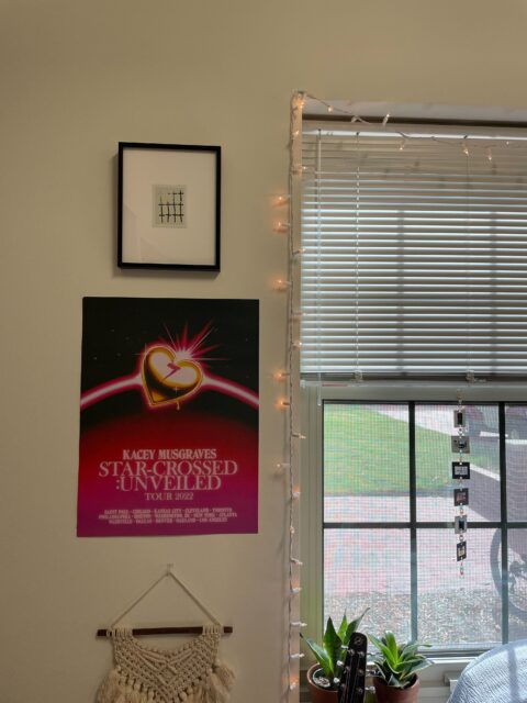
Going into ArtMate this year, I was incredibly excited- and mainly because I knew the galleries had several Andy Warhol polaroids in their collection. The idea that I, a student, had the opportunity to borrow a piece created by such an iconic artist like Andy Warhol was astounding to me. I had already seen many of his polaroids during the galleries curation of “Living Ghosts” in the Cunningham center (you can check out the exhibition here: https://sites.google.com/davidson.edu/art-around-campus/past-student-curated-exhibitions) and couldn’t wait to put one in my room.

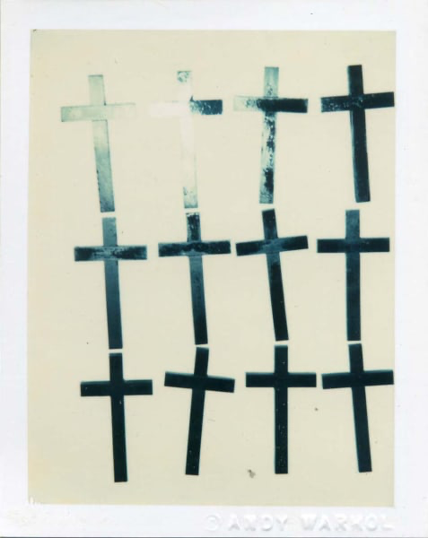
Crosses marks a bit of a departure for Warhol. Most Warhol polaroids are portraits of other artists, celebrities, or the wealthy. Some are pictured in nude and some are incredibly opulent, like in his work Unidentified Woman (Ornate Necklace) (you can check out this piece here: https://www.artworkarchive.com/profile/van-every-smith-galleries/artwork/unidentified-woman-ornate-necklace).Crosses focuses on a much simpler subject, just some iridescent paper crosses lined up together to make a pattern. In many ways, Crosses is reminiscent of some of his pop art works like his Campbell soup cans, which are also incredibly bright with great repetition. One of the most striking elements of Crosses is how each cross is the same, yet the ways in which some are turned or slightly distorted makes for some variation. This is continued by the flash against the iridescent crosses, as the top right crosses are no longer as dark and apparent as the crosses below. Warhol often called his polaroids “landscapes,” meaning that he was trying to capture the typography of his subject.
My favorite part about the piece is how ambiguous it is. Why did Warhol depart from his usual portraits? Why did he choose crosses as the symbol of repetition? Why are they shiny and blue? Did Warhol craft the crosses himself? I love how, as I get to walk past this piece every day, a new question emerges.
– Sarah Willoughby ’25

