Robert Mangold (American, b. 1973)
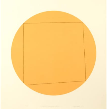
1, from Distorted Square Within a Circle , 1973
Screenprint in colors on Arches paper
27.75 x 27.75 in
Gift of John Andrew MacMahon ’95
Don’t tell Robert Mangold that square pegs don’t fit in a round hole. All jokes aside, Mangold’s 1, from Distorted Square Within a Circle exemplifies the contrast and tension built upon shapes in the work. In this strikingly minimalist work, it is the square and the circle that provides the action.
It begins at first glance with the perfectly proportional orange circle directly in the center of the piece. Then, as you turn your attention to the piece, you will notice the not-so-perfect square that occupies the inside of the circle. Mathematically, this shape does not even constitute a square at all, as the sides are not the same length and all the internal angles are not 90 degrees. But Mangold should be given some leeway on this, after all, as he states in the title “Distorted square within a circle” and not “square in a circle.” What Mangold does make abundantly clear is the contrast between the perfection of the circle and the imperfection of the square. He makes the viewer focus extensively on the shapes within the piece. In other works with much more going on, it is easy to forget about the importance of shapes and the impacts that they can have on the viewer. By turning to a minimalist form, Mangold can bring shapes and form back to the forefront of the viewer’s attention.
The Minimalist aesthetic of the work also calls to the forefront the space created in the interaction of the shapes. The circle creates a perfectly symmetrical space on the paper with a rounding slope interacting gracefully with the edge of the piece. The square invades the space inside of the circle with its jagged corners jutting into the edge of the circle. The conflicting feelings produce by the shapes highlight the space that they take up and the actions they perform. The minimalism allows the viewer to come to the piece of art and create their own story of what is happening in the work. There is no need to know any background or history about the piece, but rather the simple elements such as shape, space, and form do the heavy lifting. While Mangold shows that distorted squares do fit within a circle, he also creates a site of dialogue around shapes and space.
Oliver Poduschnick ’25

