Did you know that today, October 22nd, is National Color Day? Yes, there is a day for that, and yes, as an intern at the Van Every/Smith Galleries, I find it worth writing about.
Davidson College has many pops of color around campus, from the Yinka Shonibare’s iconic Wind Scultpure (SG) I in front of Wall Academic Center to Vivian Beer’s metallic red Machined Nature: Anchored Candy no. 9 bench. The galleries contain so many examples of color use that searching “colorful” on the collections website yields eleven pages of results. So for this very underrated holiday, I present to you four of the galleries’ most color-focused works, which use a wide variety of hues to capture concepts from cities and politics to music and abstract perceptions.
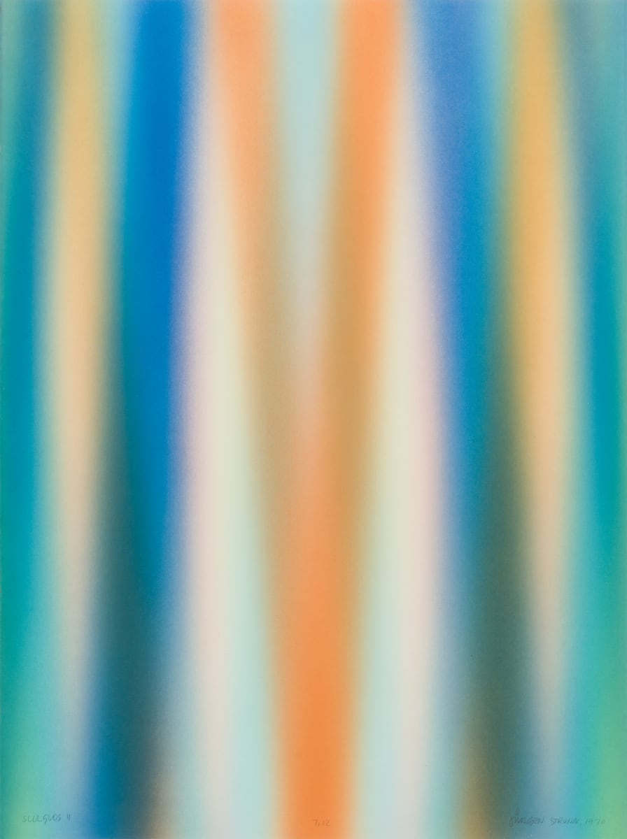
Juergun Strunck (German, b. 1943)
SULGLOS II, 1970
Relief print
35 x 27.5 x 1.25 in
Juergen Strunck’s SULGLOS II is a dizzying relief print, featuring hazy stripes of rich blues, subtle aquas, deep oranges, and pale golds that streak across the image and blur together. Each ribbon of color fades at the edges, creating gradients that transition from warm orange shades into greenish-blue hues. It is difficult for the eyes to focus on the work – the more you stare, the blurrier it seems to get. SULGLOS II leaves me with an unsettling feeling, like I’m searching for something that is just out of reach.
Juergen Strunck (German, b. 1943) is best known for his contemporary geometric prints. He has studied at the University of Munich in Germany, Wichita State University in Kansas, and the University of Dallas in Texas, where he later returned to teach (among other institutions). He has exhibited across the globe and remains an active artist in Irving, Texas.
SULGLOS II is currently on loan at the Center for Civic Engagement.
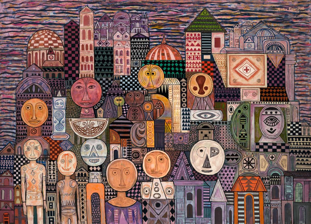
Martin Rosenthal (American, b. 1899-1974)
Cityscape, 1971
Oil on canvas
65.75 x 46.75 in
Cityscape by Martin Rosenthal features simple, round-headed figures among detailed, geometric buildings, set in front of a smudgy backdrop. Highlighting a range of muted purples, oranges, and greens, the painting’s intricate patterns of stripes, checkerboards, triangles, and more create a dynamic scene that extends into the distance and captures the stimulating nature of a city. Funny-looking faces stand out across the canvas, emphasizing the human factor among the references to urban architecture. The variety of colors, intercepted with black, add to the overwhelming sensory elements of a typical city.
Martin Rosenthal (American, 1899-1974) is from Woburn, MA. After serving in the military, he studied at the Art Students League and taught at George Luks’s Luks School of Painting. Though he did not exhibit often, Rosenthal has painted many modern works that feature abstracted imagery and dramatic swaths of color.
Cityscape can now be viewed at the Matthews Center for Career Development.
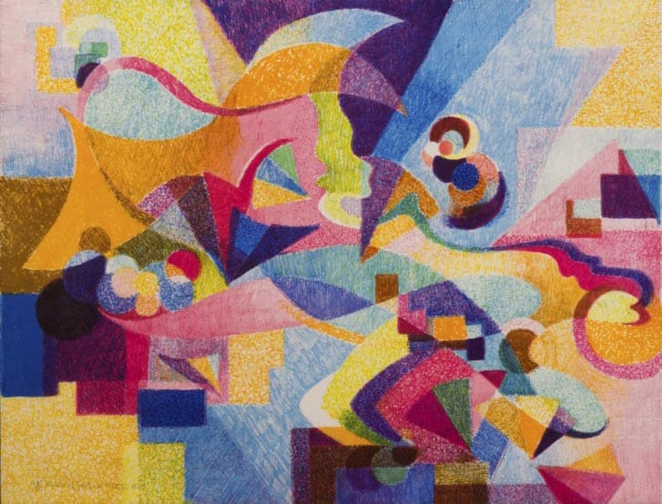
Stanton MacDonald-Wright (American, 1890-1973)
Music of Gershwin, 1973
Lithograph
19.875 x 25.875 in
Stanton MacDonald-Wright’s Music of Gershwin visualizes sound through an explosive use of color. Composed of overlapping abstract shapes, Music of Gershwin features a cacophony of bright hues that brings to mind the sounds of an orchestra warming up before a performance or the melodic notes of piano keys. The work, referring through its title to the famous Broadway composer and pianist George Gershwin, captures the intangible with various shapes and colors reflecting the dynamic nature of music.
Stanton MacDonald-Wright (American, 1890-1973) was a modern artist who studied at the Los Angeles Art Students League. A student of color theory with optical scientists in Paris, MacDonald-Wright co-founded the avant-garde movement of Synchronism and is known for his for his colorful abstract works. His art can now be found in many prominent collections, including uptown Charlotte’s Mint Museum (his work Trumpet Flowers always catches my eye).
Music of Gershwin can be spotted outside the Art History offices at the VAC.
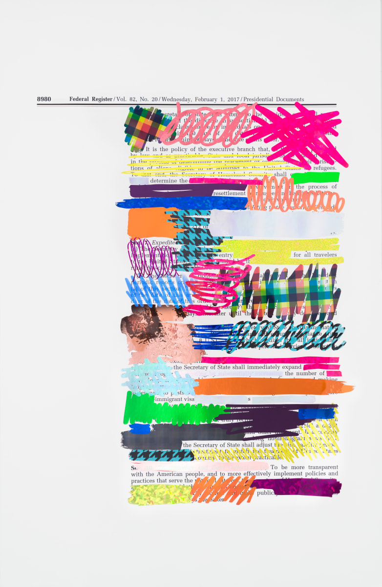
Johanna Herr (American, b. 1987)
Redaction Order 13769, Page 4, 2019
Vinyl on archival inkjet
40 x 26 in
Lastly, Redaction Order 13769, Page 4 by Johanna Herr uses color in surprising, disruptive ways. This work, as part of Herr’s Redaction Order series, shows former President Trump’s travel ban under scribbles of vibrant colors and playful patterns. These doodles, however, are not the spontaneous and messy kind that appear at the edges of my notebooks; instead, they annotate and emphasize Herr’s assessment of the xenophobic policies in this executive order. The gaps in between each redaction read a more positive message on immigration than Trump’s original decree, which contrasts with the pop of pinks, oranges, yellows, and blues of Herr’s annotations.
Johanna Herr (American, b. 1987) is a graduate of Parsons School of Design (BFA of Fine Arts) and Cranbrook Academy of Art (MFA in Sculpture). Working in both Brooklyn, NY and Mae Wang, Thailand, Herr creates works and installations that juxtapose bright colors and aesthetics with political messages surrounding institutional violence in America. Herr has exhibited widely, including at the Van Every/Smith Galleries in the 2024 exhibition, The sun still rises in spite of everything.
What is your favorite colorful artwork? Check out the Van/Every Smith Gallery’s collection and celebrate National Color Day with us!
-Gaby Sanclimenti ‘25
